New Website. At last.


It's been a while coming – ok, it's been a long time coming – but finally we have launched a brand new website.

Having um'ed and ahh'ed about the blog for almost as long as it took to build the thing, we've decided to include a fresh new blog within the new website, we'll obviously leave all this here as an archive and may update it from time to time, but our main site will now be the place new work, news and updates. There will also be some prints for sale and details about commissions. Eventually. Until then you can always email us to find out more, or just say hello.

So, head over to thecounterpress.co.uk and have a little look. If you like.

A cunning print…


Ever the optimists, Baldrick and Lord Blackadder combine on this lovely limited edition typographic print. Originally created as a birthday present for a Blackadder fan, we have 6 of the edition of just 10 prints left, and have decided to make them available for the very reasonable price of 25 whole English pounds. This includes your very own free cardboard postage tube and one of those giant stamps to get it to wherever you are. This is the very first Counter Press print that we've made available, so be gentle. 


Printed two colours (metallic warm grey and Pantone 144), with deboss, on GF Smith Colorplan Pale Grey using hand set wood and lead type. The print measures a nice 420 x 210mm and comes unframed and carefully rolled in said cardboard tube. 


£25 (incl postage and packing) email studio@thecounterpress.co.uk to order.
SOLD OUT


Detail of the 16-line wood type, printed in metallic warm grey
Hand set 24pt Placard Medium condensed and 18pt Baskerville Italic
Finishing touches – debossed and hand numbered

A visit to The Elrod Press

We've known Andy Taylor at The Elrod Press for a little while now, having met him through a friend and then spent time with him at Amberley Museum, where he helps out in the beautiful print shop they loving keep running. Andy's been a great help, with advice, abuse, and tracking down some items we've needed. Anyway, having had what Andy refers to 'letterpress correspondence' course with him via email over the past year, we decided a visit to his was in order. So, last week on a sunny Monday morning we headed south to seaside.

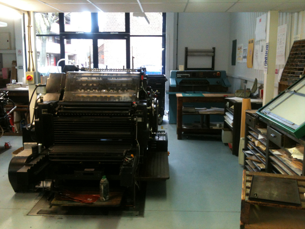
Andy, in his own words, is one of the last compositors and typesetters around. He's certainly old school. From his large printshop at the end of his garden, crammed full of typesetting machines, he's keeping hot metal letterpress alive and well. An Intertype line caster, two Elrods and a Ludlow take pride of place amongst the presses, type, matrices, metalworking tools, and what can only really be described as stuff. Lots of it too.

Andy still casts almost anything and everything a letterpress printer could want, so if you're looking you should drop him a line. We had a great day, tried our hand at casting, typeset something for a job we're working on, and then went to the pub. Here's some pics of the day (not of the pub).

Ludlow typecases

Who doesn't love Bodoni

Alignment was a lot more manual back in the day. Indesign this ain't.

Setting our job in a Ludow stick

Instructions. Handy.

Casting on the Ludlow. Just to prove we did.

Front panel from one of the Elrod strip casters from which the press takes its name

The wonderful Olley, the Elrod Press' beautiful Boxer, who sadly passed away just a couple of weeks after our visit.

A visit to Hand & Eye


On a well earned day off a few weeks ago, we headed over to visit Hand & Eye Letterpress in the East End. Tucked under the railway arches, the workshop is run by Phil Abel with Nick Gill. It's a great space, and despite clearly being a hive of activity, it's spotless. 

Phil is a long standing letterpress printer, having started Hand & Eye in 1985. So it's fair to say he has built up quite a collection of machines and type. We were introduced to their two Heidelbergs (a platen and cylinder – originally from the Gregynog Press) which sit alongside a FAG proofing press. Surrounding them are cases and cases of type. And in one corner are the Monotype casters.

Nick is the resident type caster, and through a rather dangerous-sounding process of trial and error, has got their Monotype Composition Caster and Supercaster up and running. The Composition Caster is computer operated, negating the need for keyboards and other hard to come by equipment. It also means that casting is slightly easier, so they can supply brand new type to people. This was made more exciting once we had a look at the collection of matrices the foundry has so far acquired. 

We finished off the visit finding out from Nick about the Type Museum (or perhaps more accurately, archive), where he volunteers. It turns out all is well there, and things are in the pipeline. We left clutching some beautiful printed pieces, discussing what new type we needed...

A first stab at book binding


For some time we've been harbouring ambitions of creating our own books. Not large tomes admittedly, but hand printed and bound books nonetheless. Although we have sketchbooks full of ideas and the presses up and running, we didn't know how to actually make a book. So we got in touch with Simon Goode who does.

Simon is trained in book arts, and is currently in the process of establishing the Centre for Book Arts in London. He also gives book binding lessons in his studio in East London. We arranged a two day course with him to get us started.

First up were the basics: learning about grain direction, folding, slicing and imposition. This was then put into practice with some simple, but effective three holed pamphlets, with various cover techniques. After a cuppa and a biscuit, Simon upped the ante with a slim case bound book. This involved much measuring, cutting, glueing and cursing, but the end result was definitely a book.

Day two saw us testing our folding skills with a concertina book, which it turns out is much harder than it looks. Straight folds were tricky to master, although once we added bright yellow case bound covers at each end and a belly band to finish we were pretty proud of ourselves.


Our final books were stab bound, with the thread exposed and wrapped around the spine and cover. Although the stabbing was hard work and the stitching was fiddly, the binding was hands down our favourite.


Come the end of the two days we had needle punctures and sliced fingers, but had gained new skills in the rather satisfying binding process. To celebrate we headed to the pub with Simon, trying not to spill beer on our newly bound books.

As for printed books from us, watch this space...

New prop cards and developing our identity


It's been a little while since we last posted a blog entry…ok, it's been too long, but in our defence we've been busy. Anyway, as well as buying a new galley press, we've been hard at work refining and developing our identity and printing some bits and pieces for ourselves.

First up was some new and improved prop cards. We were really pleased with the design of the previous cards (see the post below), but we knew that the print could be improved. So ever the perfectionists we reset the job from scratch and set to work on version two.


Better inking of the opaque white improved the subtlety of the background, leaving the text to really stand out. We then refined the typographic rules to create more of a visual hierarchy, tweaked the copy and finally added our monogram to finish it off.


We've also designed our stationery suite, business cards to come soon. But for now a little preview of the address labels.

Printing our 'prop' card

The Counter Press prop card
There's a long held tradition for private presses to print 'prop' cards, small calling cards that explain who owns the press and what its purpose is. It's also a means by which to register ownership of the press name. The Briar Press describes them as…
Adapted from All About Prop Cards

(1982) by J. Ben Lieberman
The term “prop” is short for “proprietor,” stressing the individuality of the private press owner and operator, exercising freedom of the press. The prop’s card, or prop card, is akin to a calling card: printed on a letterpress, it has a standard form and bears a few essential pieces of information as described below … The prop card is used primarily, or ostensibly, for an address file. Hence, the prop card traditionally has the prop’s last name first, in the upper left corner of a standard 3x5 inch card, using reasonably stiff stock printed horizontally. The full name of the press and mailing address follow. Prop cards may also be double-sized, i.e., a 5x6 card folded to create a double 3x5 card, with the prop’s name at the top left on the front side, just below the fold.
Having already printed thank you cards, we decide our second print should be our 'prop' card. Time to make this official. Sort of.
Hand typeset 8pt Plantin Roman and Italic
The card was designed around a structural typographic background printed in opaque white on GF Smith Colorplan Real Grey using an 8-line condensed grot wood typeface. This was then overprinted with two columns of handset 8pt Plantin 110 roman and italic in black.

The white on grey reacts differently under different lighting to great effect
The finished cards – a limited edition of just 10.

Related Posts Plugin for WordPress, Blogger...